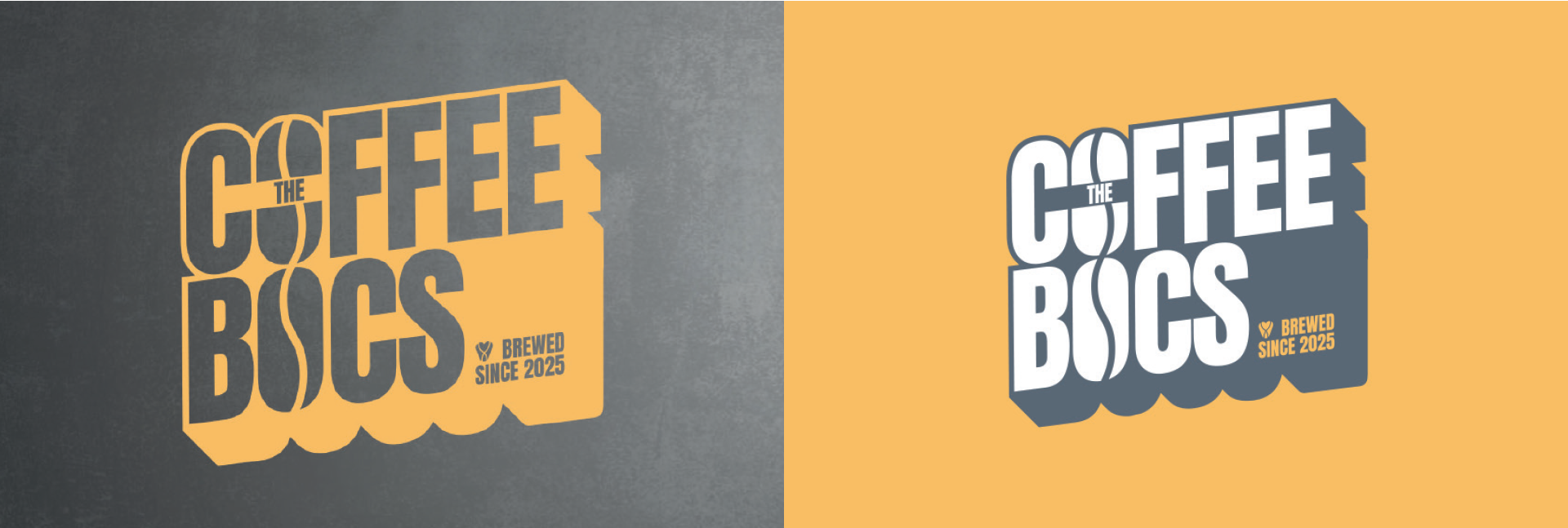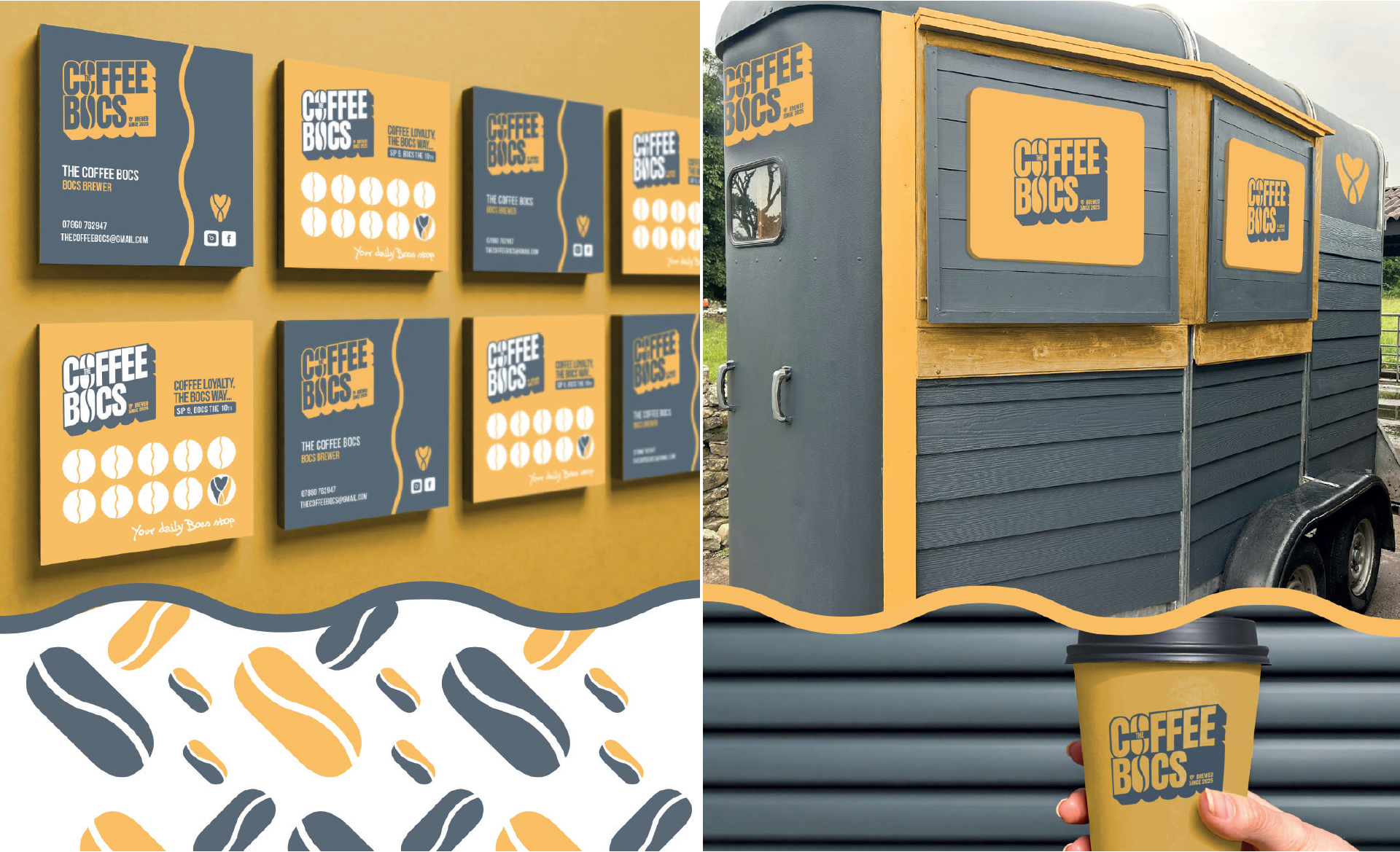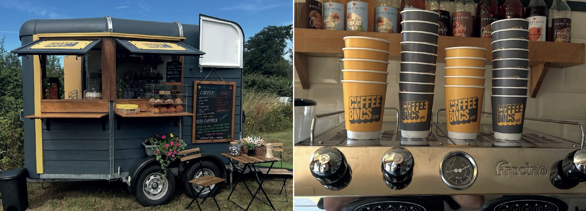
Designing a logo and brand style for the launch of a new coffee van enterprise could easily have gone down the route of a clichéd coffee cup logo; something that’s been seen many times before. Instead, my client wanted something bold that reflected the shape of the actual van, a converted horse box no less, and would really stand out from the competition.
It was a great opportunity to be creative and shape the whole look of the business, from the interior and exterior of the van through to the various coffee-related materials, creating a cohesive visual style throughout.
My client was over the moon with the result and is still enjoying being seen around the Vale, delivering great coffee and bringing the brand to local events.